21 Best HTML Email Builders for Designers in 2026

Most email builders treat design as an afterthought. They give you rigid templates and limited customization, assuming designers will just make do. But if you care about visual quality, about brand consistency and typographic details and layouts that actually look designed, you need a different class of tool.
This guide covers the email builders that give designers real creative control. These tools understand that email design is design, not just filling in templates.
For a broader overview, see my complete guide to HTML email builders. If you work with marketing teams, my guide to HTML email builders for marketers covers tools from their perspective.
Best Designer Email Builder by Workflow
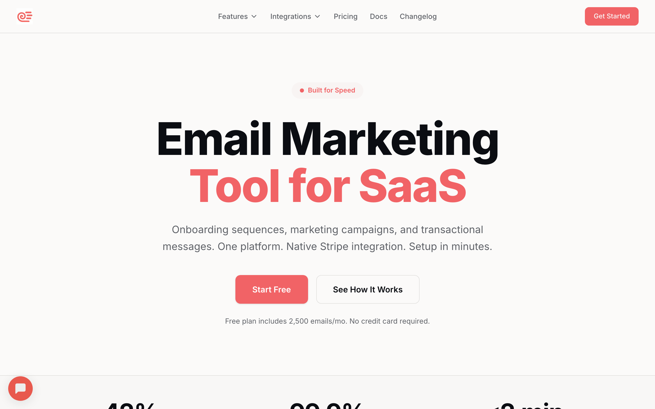
Best email builder for SaaS design systems: Sequenzy
Sequenzy is the best fit when designers need to define a system that marketers can reuse safely. Its email editor, reusable templates, and lifecycle-focused blocks help keep onboarding, product updates, and transactional emails visually consistent. Start with SaaS onboarding templates and product launch templates.
Best email builder for pixel-level creative control: Postcards
Postcards is strongest when the designer owns the final visual quality and wants precise control over spacing, typography, sections, and responsive behavior. It is better for polished branded campaigns than for quick operational sends.
Best email builder for Figma-native teams: Emailify
Emailify is the better fit when the design source of truth is already Figma and email export needs to stay close to the design workflow. It reduces the handoff between designer and builder, though QA is still needed before sending.
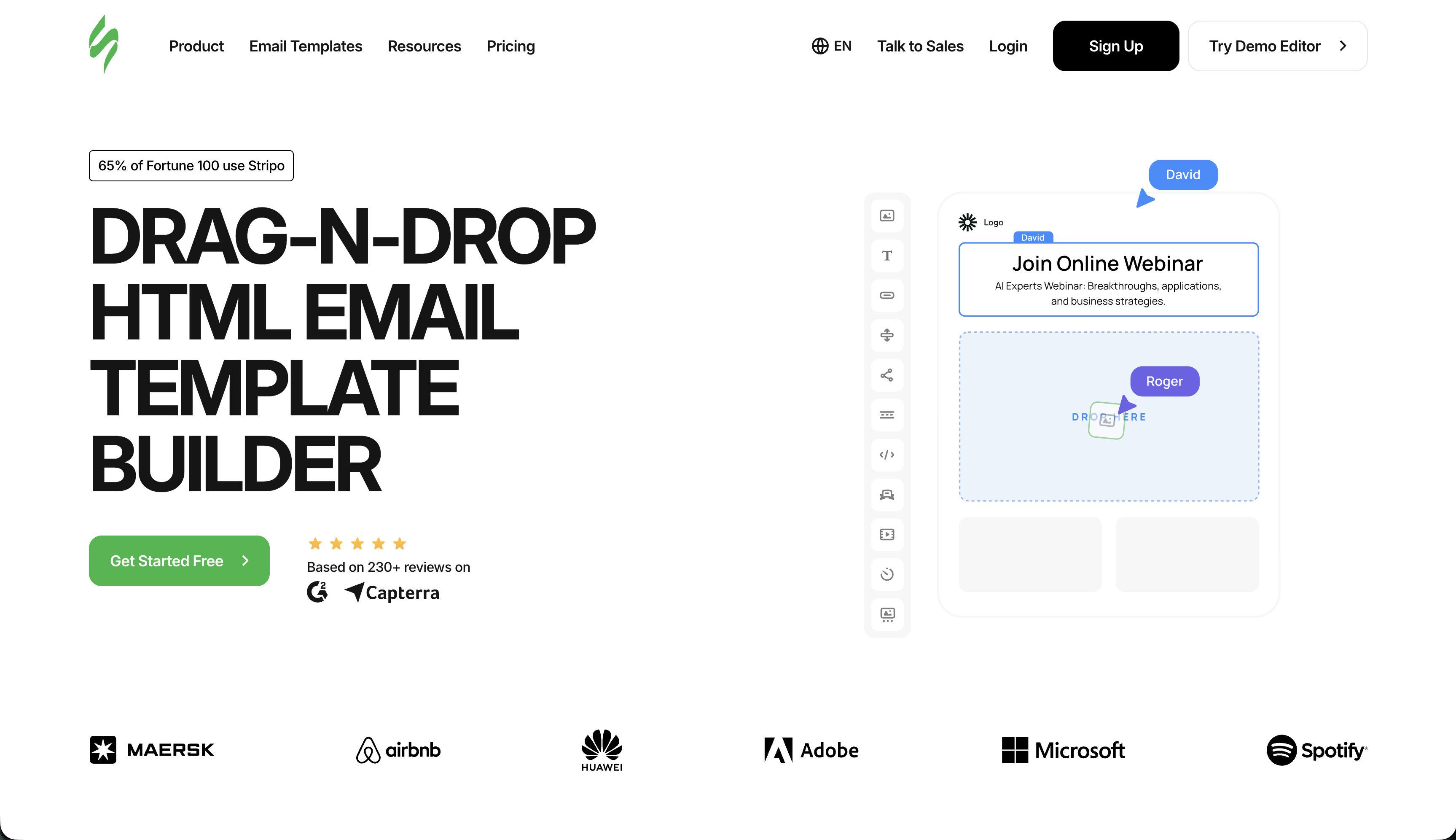
Best email builder for template-led production design: Stripo
Stripo makes sense when designers need strong starting points, reusable modules, and enough customization to keep campaigns on-brand. It is especially useful when design quality matters but production volume is high. See the template builder guide.
Best email builder for collaborative design review: Chamaileon
Chamaileon is stronger when designers, account managers, clients, and copywriters all need to review the same email in context. For agency-style feedback loops, the HTML email builders for agencies guide is the better supporting resource.
The Design Challenge with Email
Email design is frustrating because you can't use the tools and techniques you've mastered for web. Flexbox doesn't work. Grid doesn't work. External stylesheets are stripped. Outlook still renders with Microsoft Word's engine, which means layouts that work everywhere else break spectacularly in one of the most popular email clients.
The constraints are real, but they don't mean email design has to look bad. The best design-focused email tools solve this by:
Providing real creative control within the constraints of email. You can achieve the design you want, just through different means. The constraints are handled by the tool, not by you.
Handling the technical translation so designers don't need to understand email HTML quirks. You design visually; the tool generates the nested tables, inline styles, and conditional comments that make it work across clients.
Supporting design system integration so email stays consistent with your broader brand identity. Colors, typography, and spacing from your design system should carry through to email without manual recreation.
Offering precise control over spacing, typography, and responsive behavior. Email design tools that round spacing to the nearest 10px or limit font options are frustrating for designers who care about precision.
Dark mode awareness is increasingly important. Email clients render dark mode differently, and designers need tools that help them preview and adjust for these variations rather than being surprised when their carefully chosen colors are inverted.
Quick Comparison
| Tool | Best For | Starting Price | Free Tier | Design Flexibility |
|---|---|---|---|---|
| Sequenzy | SaaS design systems | $19/mo | Yes | Design system approach |
| Postcards | Maximum design control | $17/mo | Yes | Pixel-perfect, granular |
| Emailify (Figma) | Figma-native teams | $7/mo | No | Figma design, email export |
| Stripo | Template starting points | $15/mo | Yes (4 exports) | Good, module-based |
| Chamaileon | Design collaboration | $20/mo | No | Good, collaborative |
| Bee Free | Budget design | $15/mo | Yes (branding) | Mobile-specific editing |
| Flodesk | Visual-first design | $38/mo | No | Beautiful defaults |
| Tabular | Modern design system | $19/mo | No | Brand token system |
| Mailchimp | Design within ecosystem | $13/mo | Yes | Content Studio, brand kit |
| HubSpot | CRM-connected design | $20/mo | Yes | Smart content, modules |
| Campaign Monitor | Template lock-in | $11/mo | No | Protected brand elements |
| Klaviyo | E-commerce design | $45/mo | Yes | Product-aware layouts |
| ActiveCampaign | Automation + design | $29/mo | No | Conditional design blocks |
| MJML | Code-based precision | Free | Yes | Maximum code control |
| React Email | Component design | Free | Yes | Component-based system |
| MailerLite | Creator aesthetics | $10/mo | Yes | Clean, contemporary |
| Brevo | Budget EU design | $9/mo | Yes | Standard, functional |
| Moosend | Affordable quality | $9/mo | 30-day trial | Adequate for most needs |
| GetResponse | Funnel design | $19/mo | Yes | Landing page + email |
| Omnisend | E-commerce visual | $16/mo | Yes | E-commerce design blocks |
| Benchmark | Simple quality | $13/mo | Yes | Smart design tools |
Top Email Builders for Designers
1. Sequenzy - Best for SaaS Design Systems
Price: Free tier, then from $19/month
Sequenzy's visual editor is designed for consistency rather than maximum flexibility. You define your brand colors, typography, and spacing system, and the editor keeps everything on-brand automatically.
For design systems that need to scale, this approach works well. Marketing teams can build emails within the established design system without accidentally breaking brand guidelines. The editor enforces the system: pre-approved colors appear in the color picker, brand fonts are the default, and block spacing follows defined patterns.
The block library covers common SaaS email patterns: onboarding flows, feature announcements, pricing changes, and transactional messages. If you're designing for a software product, these starting points are more relevant than generic templates. Each block is designed to work harmoniously with others, so combining multiple blocks produces cohesive layouts without manual visual tuning.
The AI content generation can draft text that fits your established tone, which helps maintain brand voice across high volumes of email. For designers who often receive copy that doesn't fit their layouts, the AI can adjust content length to match design constraints.
Sequenzy's approach is particularly valuable for teams where designers create the system and non-designers use it daily. You set up the templates, brand assets, and block library once, then the marketing team builds within those constraints. The designer's vision is preserved even when they're not personally building every email.
Best for: SaaS companies wanting brand consistency at scale
Limitations: Less creative freedom than Postcards
2. Postcards by Designmodo - Best Overall for Design
Price: Free tier, paid from $17/month
Postcards feels like a design tool that happens to output email HTML. The interface is clean and modern, the controls are precise, and the output quality is excellent.
The modular system gives you 100+ pre-designed blocks to work with. Unlike rigid templates, these blocks are genuinely customizable. You can adjust every visual property: spacing, colors, typography, borders, shadows, and image treatments. The blocks snap together to create cohesive layouts, but you can break the cohesion intentionally when the design calls for it.
Typography control is better than most builders. You can use custom fonts (with proper fallbacks), adjust line height and letter spacing, and control text styles at a granular level. For brands where typography matters, this is essential. You're not limited to a dropdown of five fonts; you can use any web font and specify exactly how it renders.
The responsive behavior editor is particularly good. You can see and adjust exactly how your design adapts to different screen sizes. Mobile isn't an afterthought; it's part of the design process. You can set specific breakpoints, adjust element visibility, and modify spacing for different screen sizes independently.
One feature designers appreciate: the color system. Define your brand colors once, and they're available throughout the editor. Change a brand color, and it updates everywhere. This kind of systematic approach is rare in email builders, and it mirrors how design systems work in web and product design.
The export quality deserves specific mention. Postcards generates HTML that renders cleanly across email clients, including Outlook. The tool handles the technical translation of your design into table-based email HTML, so you never see the nested tables and VML conditionals that make it work.
Best for: Designers who want full creative control
Limitations: Steeper learning curve, smaller template library than Stripo
3. Emailify for Figma - Best for Figma Teams
Price: From $7/month
If your design team works in Figma, Emailify is transformative. You design the email in Figma using familiar tools, then export directly to email-compatible HTML. The plugin handles the translation from modern design to email-safe code.
This workflow means designers work in their native environment. No learning a new tool, no compromises on the design process. Create the email exactly as you want it in Figma, then export. The plugin understands Figma's auto-layout, component structure, and design tokens, so the translation is intelligent rather than just pixel-based.
The plugin is smart about the translation. It converts auto-layout to table structures, replaces web fonts with fallbacks, and generates responsive rules. Complex designs may need manual adjustment, but standard layouts export cleanly. The plugin provides warnings when it encounters design patterns that won't translate well to email, so you can adjust before exporting rather than discovering issues after.
For design-driven organizations where Figma is the source of truth, Emailify keeps email design integrated with the broader design system. Email templates can reference the same components, colors, and typography as your web and product designs. This consistency across touchpoints is valuable for brand-conscious organizations.
The workflow also enables better collaboration between designers and developers. Designers create in Figma, and if the exported HTML needs adjustment, developers can refine the code directly. The Figma file remains the design source of truth.
Best for: Design teams already in Figma
Limitations: Requires Figma, complex designs may need manual adjustment
4. Stripo - Best Template Starting Points
Price: Free tier, paid from $15/month
Stripo's massive template library (1,500+ templates) gives designers strong starting points. Rather than building from scratch, you can find a template close to your vision and customize it.
The editor provides good design controls. You can adjust most visual properties, work with custom fonts, and fine-tune spacing. It's not as design-native as Postcards, but it's more flexible than most builders. The property panel is well-organized, grouping related settings together so you're not hunting for options.
The "Smart Elements" feature is useful for dynamic designs. You can create conditional content that changes based on subscriber data, which enables personalized design variations. Show a different hero image to different segments, or adjust the layout based on subscriber preferences. This combines design control with data-driven personalization.
For agencies working with multiple brands, Stripo's organization features help maintain separate design systems for each client. Each workspace can have its own module library, brand colors, and template collection, so designers switching between clients don't carry visual elements from one brand to another.
The module library is particularly useful for designers building systems rather than one-off emails. Create a complete set of branded modules (header variants, content blocks, CTA styles, footer options) and let the marketing team assemble emails from these pre-approved components.
Best for: Designers who want extensive starting templates
Limitations: Less precise control than Postcards
5. Chamaileon - Best for Design Collaboration
Price: From $20/month
Chamaileon shines when multiple designers work on email campaigns. Real-time collaboration, commenting, and version history make it easy to iterate with teams.
The design controls are solid. You get granular spacing adjustments, custom fonts, and good responsive control. The modular approach lets you build component libraries that maintain consistency across campaigns. Each component can have locked properties (brand colors, fonts) and editable properties (text content, images), giving designers control over what can and can't be changed by non-designers.
For agencies with design teams serving multiple clients, Chamaileon's workspace organization keeps brand assets and templates properly separated. The workspace model means designers see only relevant brand materials when working on a specific client, reducing context-switching friction.
The client review feature is particularly useful. You can share preview links with stakeholders who can comment directly on the design. This streamlines the approval process compared to exporting screenshots or PDFs. Comments are anchored to specific elements, so feedback like "make this heading smaller" is unambiguous because you can see exactly which heading they mean.
Version history is valuable for design iteration. You can compare any two versions side by side, see what changed, and revert specific changes without losing other work. For complex emails that go through multiple review cycles, this prevents the "which version was the approved one?" confusion.
Best for: Design teams needing collaboration features
Limitations: More expensive than simpler tools
6. Bee Free - Best Free Design Tool
Price: Free with branding, paid from $15/month
Bee Free offers legitimate design capabilities on a free tier. You can't customize everything, but for many projects, the controls are sufficient.
The mobile design editor stands out. You can design the mobile version separately from desktop, which lets you make meaningful adaptations rather than just letting the layout reflow. Adjust font sizes, hide decorative elements, and reorder content blocks for the mobile experience. This level of mobile control is unusual for a free tool.
The template library is decent, with templates that feel more contemporary than many competitors. The designs follow current trends without being trendy, which means they'll age well. The export options are flexible, supporting most major ESPs.
The block-level design controls cover the essentials: colors, spacing, fonts, borders, and background images. While not as granular as Postcards, they're sufficient for most commercial email designs. The interface is fast and responsive, which matters for designers who work iteratively.
For more on free options, see my guide to free HTML email builders.
Best for: Designers on tight budgets
Limitations: Free tier includes branding, limited advanced features
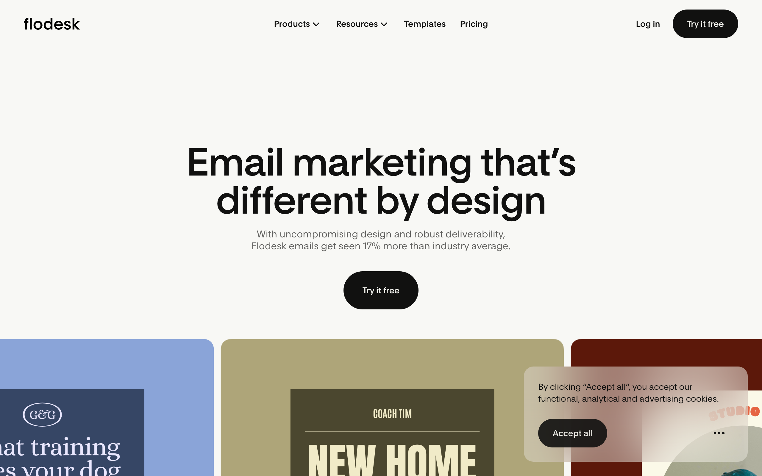
7. Flodesk - Best for Visual-First Brands
Price: From $38/month (flat rate)
Flodesk's design quality stands out in a category where most tools produce functional but unremarkable output. The default templates look genuinely beautiful - layouts that wouldn't look out of place in a design portfolio. For visual brands, lifestyle companies, and designers whose clients care deeply about aesthetics, Flodesk's defaults raise the bar.
The editor prioritizes ease of beautiful output over granular control. You can't adjust every pixel, but the constraints Flodesk imposes tend to push you toward good design decisions. Think of it like a well-designed opinionated framework rather than a fully configurable toolkit.
The flat-rate pricing ($38/month regardless of list size) becomes increasingly economical as your list grows. For designers managing clients with rapidly growing lists, the predictable cost is appealing.
Best for: Visual brands, lifestyle companies, designers valuing aesthetics over granular control
Limitations: Less flexible than Postcards, limited automation
8. Tabular - Best for Design Token Systems
Price: From $19/month
Tabular is one of the newer entrants built with design systems thinking. The brand styles system lets you define colors, fonts, button styles, and spacing as tokens that propagate throughout every email. This is closer to how design systems work in web development than most email tools allow.
For designers who work with design tokens in Figma or other tools, Tabular's approach feels natural. Define the design system once, build emails from it. Updates to tokens update everywhere, which is essential for maintaining consistency at scale.
The editor itself is clean and modern, without the legacy complexity that older tools have accumulated. The learning curve is low, and the output is professional.
Best for: Designers who think in design token systems
Limitations: Smaller template library, less established than legacy tools
9. Mailchimp - Best for Design Within an Ecosystem
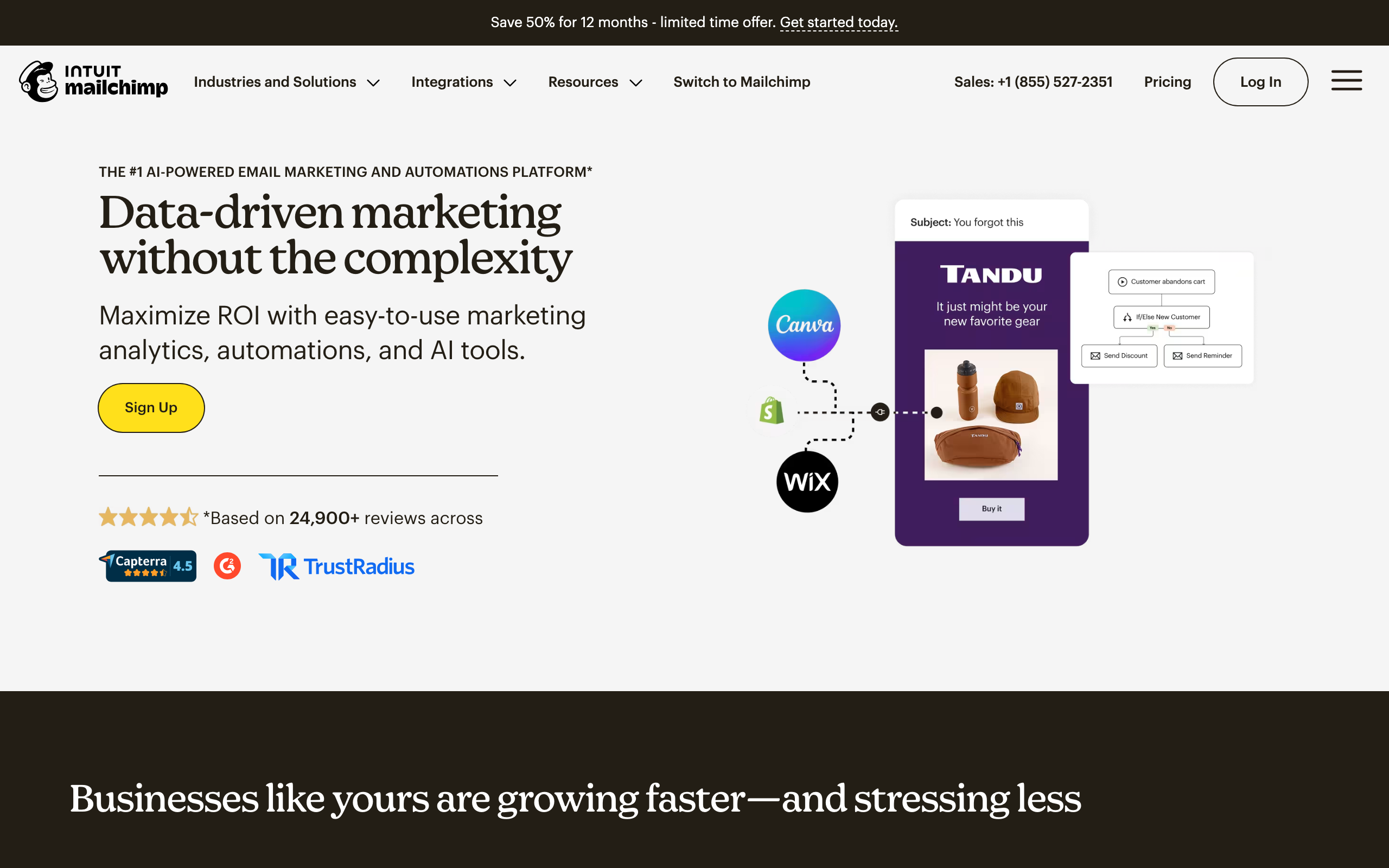
Price: Free tier, from $13/month
For design teams working within the Mailchimp ecosystem, the Content Studio provides centralized brand asset management. Approved colors, logos, fonts, and images are available to every team member building emails. The Creative Assistant AI generates design variations based on your brand guidelines, useful for creating multiple versions for testing.
While Mailchimp's design controls are less granular than Postcards or Chamaileon, the seamless integration with sending, automation, and analytics makes it practical for designers who need to see emails through to performance measurement.
Best for: Designers working in the Mailchimp ecosystem
Limitations: Locked to Mailchimp, design controls less precise than specialized tools
10. HubSpot - Best for CRM-Connected Design
Price: Free tier, from $20/month
HubSpot's email module system allows designers to create templates where some sections are brand-protected and others are editable by marketing teams. Smart content blocks show different designs to different audience segments within the same template, which requires thinking about design at the segment level rather than just the email level.
For design teams at companies deeply embedded in HubSpot, working within the native email designer maintains the connection between visual design and the CRM data that drives personalization.
Best for: Designers at HubSpot-centric organizations
Limitations: Expensive at higher tiers, significant ecosystem lock-in
11. Campaign Monitor - Best for Design Protection
Price: From $11/month
Campaign Monitor's template lock-in is valuable for designers who need to protect their work from modification. You build the template with specific sections designated as editable. Marketing teams can change text and images in allowed areas, but the structural design, brand colors, and layout remain protected.
For designers whose carefully crafted templates regularly get "improved" by well-meaning but design-inexperienced colleagues, this protection preserves design intent across the entire email program.
Best for: Designers needing to protect templates from unauthorized modification
Limitations: No free tier, US-based, basic automation
12. Klaviyo - Best for E-commerce Design
Price: Free up to 250 contacts, from $45/month
For designers working with e-commerce brands, Klaviyo's product-aware design blocks create opportunities unavailable in general builders. Product recommendation blocks can be styled like any design element while automatically populating with personalized product data. The layout adapts dynamically to different numbers of products without breaking the design.
Designing emails that look intentional regardless of dynamic content quantity is a unique design challenge. Klaviyo's block system handles variable product counts gracefully, which lets designers create templates that maintain their visual quality whether showing 1 product or 12.
Best for: Designers for e-commerce brands
Limitations: Expensive, overkill for non-e-commerce use cases
13. ActiveCampaign - Best for Conditional Design
Price: From $29/month
ActiveCampaign's conditional content blocks allow designers to create templates where different visual sections appear based on subscriber data. This means a single template can show design variation A to segment 1 and design variation B to segment 2 - maintaining design quality across all versions without duplicating the base template.
For designers managing large email programs where personalization matters, this conditional design capability allows maintaining visual quality without creating dozens of separate templates.
Best for: Designers working on complex segmented email programs
Limitations: Design tool itself is less refined, automation focus over design
14. MJML - Best Code-Based Design Control
Price: Free (open source)
For designers comfortable with code, MJML provides maximum control over email output. Every spacing value, color, and layout decision is explicit in the code rather than controlled by a visual editor. What you specify is exactly what you get - no interface abstractions that might round values or limit properties.
The MJML syntax is readable and well-documented. For designers who cross into development, the code-design collaboration MJML enables is smoother than most other approaches.
Best for: Designer-developers wanting complete control through code
Limitations: No visual editor, requires MJML syntax knowledge
15. React Email - Best for Component-Based Design
Price: Free (open source)
React Email brings component-based design thinking to email. Design systems built in React can extend to email, maintaining consistency between product UI and email design. For design teams working with developers, React Email creates a shared language for email templates.
The component library handles email client compatibility, so designers can focus on the visual expression rather than the underlying HTML compatibility constraints.
Best for: Design teams working in React-based organizations
Limitations: Requires React knowledge, engineering collaboration needed
16. MailerLite - Best for Creator Aesthetics
Price: Free up to 1,000 subscribers, from $10/month
MailerLite's email templates have a contemporary aesthetic quality that many larger platforms lack. The designs feel like they were made by people who care about visual quality, not just functional templates. For creator brands where the email aesthetic is part of the brand identity, MailerLite's default quality raises the floor.
The new editor is significantly more capable than the legacy version. Custom fonts, spacing controls, and the ability to preview across device sizes are all available.
Best for: Creators and lifestyle brands where email aesthetic is brand identity
Limitations: Limited for complex enterprise design needs
17. Brevo - Best Budget Design Option
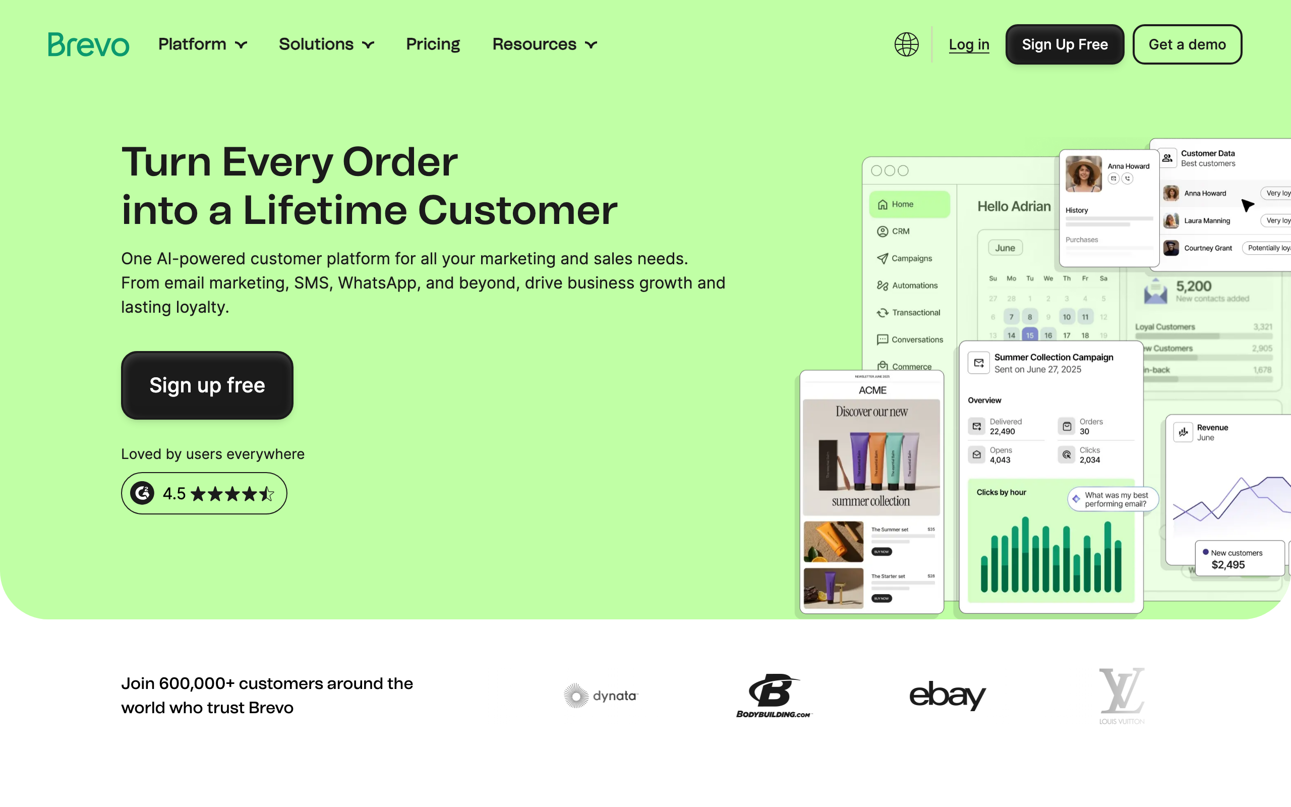
Price: Free up to 300/day, from $9/month
Brevo's email builder covers design basics at accessible pricing. For EU-based design teams or budget-conscious projects, the tool provides standard design capabilities without premium pricing.
The template library is adequate for most commercial needs. Design controls are functional - you can maintain brand consistency and produce professional output, even if the precision controls don't match tools like Postcards.
Best for: Budget-constrained designers and EU-based projects
Limitations: Less design precision than premium tools
18. Moosend - Best Affordable Design Platform
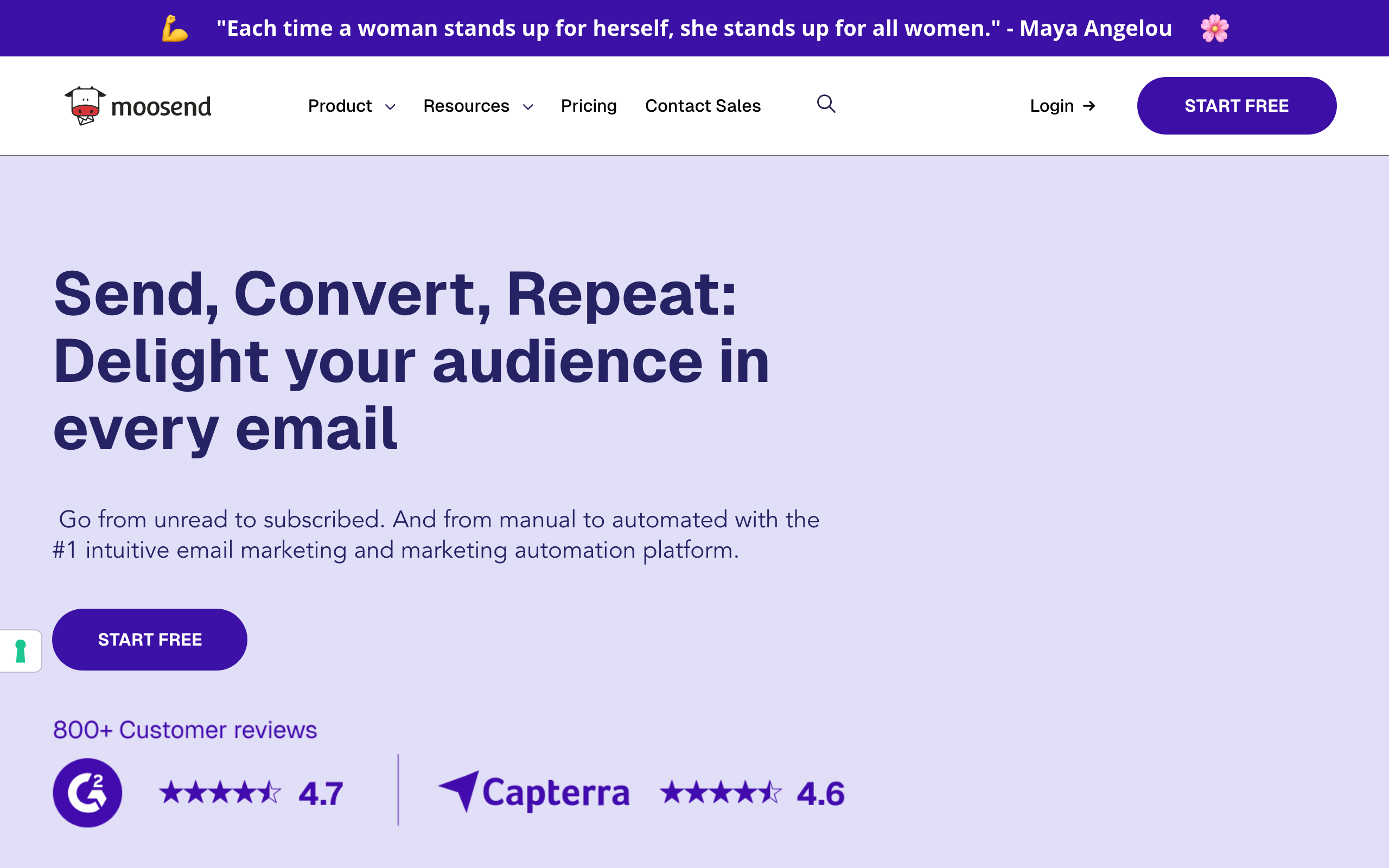
Price: 30-day trial, from $9/month
Moosend provides a solid platform for designers who need capable email building at accessible pricing. The editor includes custom fonts, detailed spacing controls, and responsive design preview. For most commercial email design needs, Moosend's capabilities are sufficient.
The countdown timer and other dynamic elements add design-level functionality that engages subscribers beyond static layouts.
Best for: Designers managing client work at moderate budgets
Limitations: Less design sophistication than specialized tools
19. GetResponse - Best for Landing Page Design Consistency
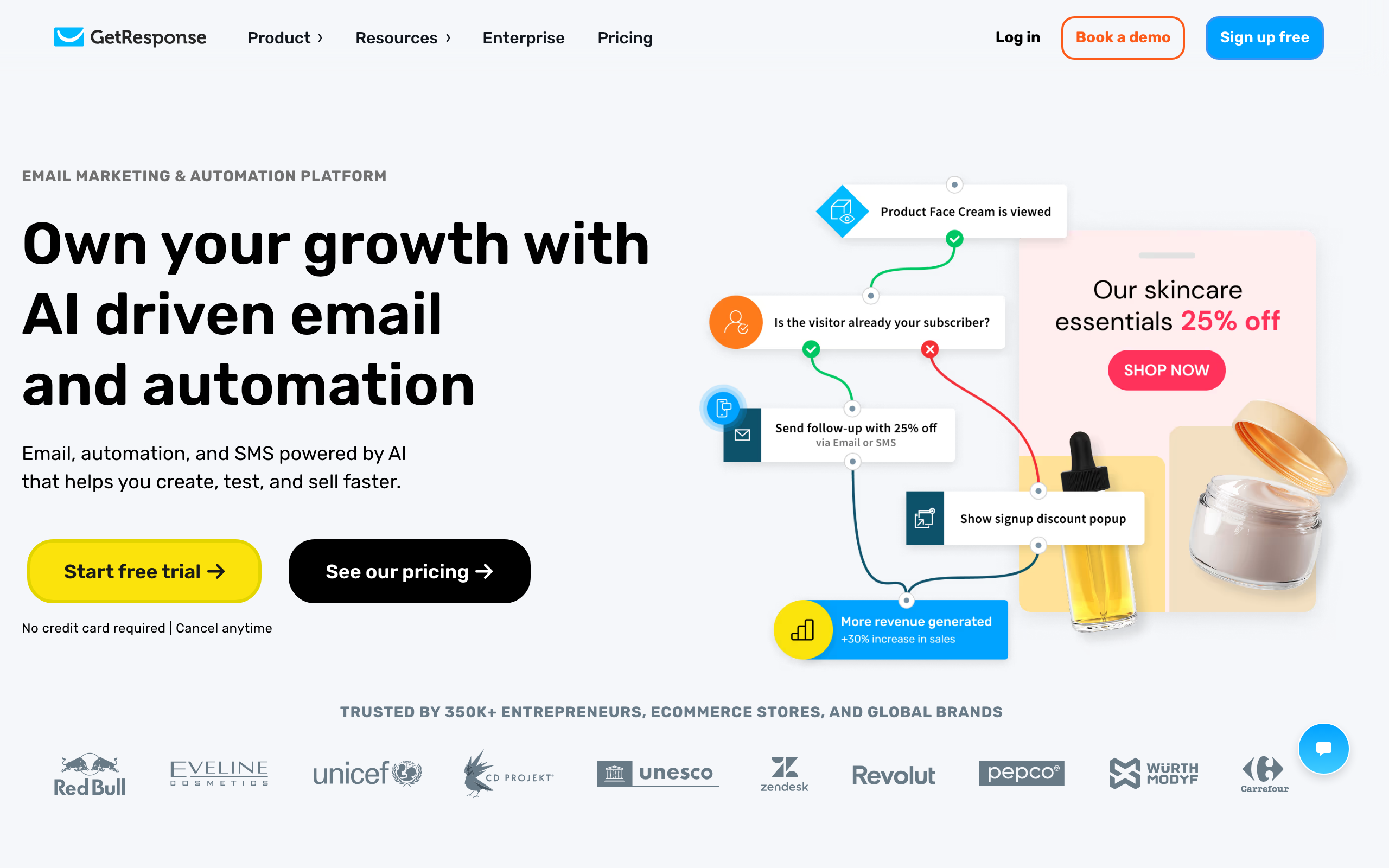
Price: Free up to 500 contacts, from $19/month
For designers creating visual systems that span both email and landing pages, GetResponse's unified interface means design decisions carry across both surfaces. The same visual builder handles both, so brand consistency between emails and landing pages is easier to maintain.
Best for: Designers creating email + landing page design systems
Limitations: Dated UI, design controls less precise
20. Omnisend - Best for E-commerce Visual Design
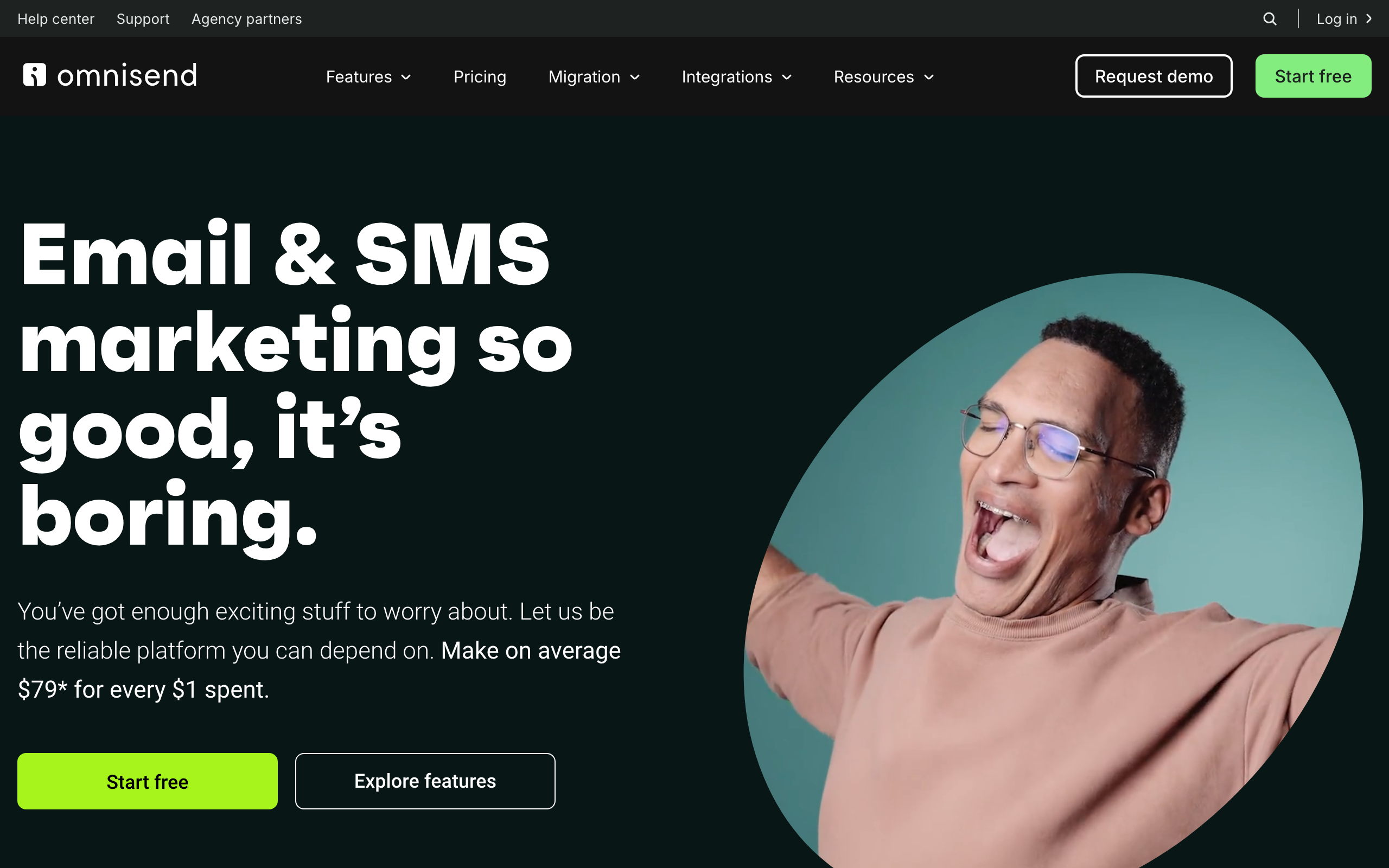
Price: Free up to 250 contacts, from $16/month
Omnisend's e-commerce-specific design blocks (product showcase, discount code, scratch card) create visual design opportunities specific to online retail. For designers working with e-commerce brands, these elements allow more creative executions than general-purpose templates.
Best for: Designers for growing e-commerce brands
Limitations: US-based, less design depth than Klaviyo
21. Benchmark Email - Best for Simple Design Quality
Price: Free up to 500 contacts, from $13/month
Benchmark's smart design tools help designers create visually coherent emails quickly. The inbox checker gives confidence that designs will render correctly. For designers working on straightforward commercial email programs, Benchmark provides adequate design controls at accessible pricing.
Best for: Designers working on simple commercial email programs
Limitations: Less design precision for complex visual work
Design Considerations for Email
Typography in Email
Web fonts work in Apple Mail, iOS, and some versions of Android. They fail in Outlook and Gmail. Always specify fallback fonts:
font-family: 'Your Font', Arial, sans-serif;
Line height and letter spacing work inconsistently. Test carefully, and avoid extreme values. The safest approach is to use line heights between 1.4 and 1.6 and avoid negative letter spacing entirely.
For brands that depend on specific typefaces, accept that web fonts won't render everywhere and choose fallback fonts that maintain the design intent. A serif brand font falling back to Arial is more jarring than falling back to Georgia or Times New Roman.
Spacing and Layout
Use padding generously. Email clients render spacing unpredictably, and generous padding provides visual breathing room while absorbing rendering differences. What looks like comfortable spacing in your editor might feel cramped in certain Outlook versions.
Single-column layouts are safest. Multi-column layouts work but require careful testing, especially for the transition to mobile. When using multi-column layouts, ensure each column makes sense as a standalone block when stacked on mobile.
Avoid relying on exact pixel-level spacing for your design to work. Email clients add and remove padding in unpredictable ways. Design with enough tolerance that a few pixels of difference won't break the visual composition.
Images in Email
Some email clients block images by default. Design so the email is still comprehensible without images. Use ALT text that communicates if images don't load. For images that convey critical information (like a promotion's discount percentage), include the key information in HTML text as well.
Image dimensions should be set explicitly. Email clients don't handle responsive images the same way browsers do. Set width in pixels or percentage. Always specify height to prevent layout shifts during image loading.
Background images are tricky. They work in most clients but fail in many versions of Outlook. Have a fallback background color that maintains readability. VML code can force background images to work in Outlook, but this adds complexity that most builders handle for you.
Retina displays require 2x images for crisp rendering. Upload images at twice the displayed dimensions. A 600px-wide hero image should be uploaded at 1200px. This matters for Apple device users, who are often the majority of email openers.
Dark Mode
Email clients now have dark mode, and they transform your designs unpredictably. Some invert colors, some don't. Some respect your dark mode styles, some ignore them. There are three categories of dark mode behavior:
- No color changes (some Outlook versions): Your design appears as-is
- Partial inversion (Apple Mail): Light backgrounds become dark, but dark elements stay dark
- Full inversion (some Gmail/Outlook versions): All colors are inverted
Test in dark mode, but accept that you can't control every rendering. Use color values that remain legible when inverted. Avoid pure black (#000000) backgrounds, as they may be lightened in dark mode, making dark text on them illegible. Use near-black (#1a1a1a or similar) instead.
Consider adding dark mode-specific CSS using @media (prefers-color-scheme: dark) for email clients that support it (Apple Mail, some Outlook). This lets you intentionally design for dark mode rather than hoping the automatic inversion looks acceptable.
Workflow Recommendations
For Solo Designers
Start with Postcards or Bee Free. Both offer good design control without overwhelming complexity. Build a library of your own templates that you can customize for each campaign.
Create a personal component library early. Save your best-designed headers, CTAs, footers, and content sections so you can assemble new emails from proven components rather than redesigning each time.
For Design Teams
Chamaileon or Stripo provide the collaboration features you need. Establish design standards and component libraries that everyone can access. Document your email design system: approved colors, typography scale, spacing units, and image guidelines.
Run periodic design reviews where the team evaluates recent emails and identifies opportunities for improvement. Email design skills improve faster with peer feedback than solo practice.
For Figma-First Teams
Use Emailify to keep email integrated with your broader design workflow. Design in Figma, export to email. This maintains design system consistency and lets designers work in familiar tools.
Create a Figma component library specifically for email that accounts for email's constraints. Components should use single-column layouts, inline-friendly styling, and fallback-ready typography. This prevents designers from creating designs that look beautiful in Figma but can't translate to email.
For Design + Development Teams
Consider pairing a design-focused builder with developer tools. Designers create the visual template in Postcards or Chamaileon, then developers implement it in MJML or React Email for programmatic use. See my guide to HTML email builders for developers.
This pairing works well for organizations that send both marketing and transactional emails. Designers own the visual system, developers own the implementation, and both work from a shared design source of truth.
Quality Assurance for Design
Your beautiful design needs to work everywhere:
Test in Litmus or Email on Acid to see rendering across email clients. What looks perfect in your browser might be broken in Outlook 2019. Pay particular attention to Outlook (all versions), Gmail (web and app), and Apple Mail. These three cover the vast majority of email opens.
Check mobile rendering on actual devices. The preview in your email builder isn't the same as a real iPhone or Android phone. Device-specific rendering quirks can affect spacing, font rendering, and image display.
Verify dark mode appearance in Gmail and Apple Mail. Your carefully chosen colors might be inverted. Test both "light" and "dark" modes to ensure readability in both contexts.
Test without images to ensure the email is still comprehensible. Many corporate email clients block images by default. Your email should communicate its core message through text alone, even if images add significant visual value.
Validate accessibility by checking color contrast ratios, verifying that alt text is descriptive, and ensuring the reading order makes sense. Good design is inclusive design, and accessible emails reach more subscribers effectively. Make sure your email authentication is set up properly too; a beautifully designed email that lands in spam helps nobody.
Frequently Asked Questions
Can I achieve pixel-perfect email designs across all clients?
No. Email clients render HTML differently, and pixel-perfect consistency is not possible. Instead, aim for "acceptably consistent." Your email should look intentionally designed everywhere, even if spacing differs by a few pixels between clients. Design with tolerance for variation, and focus on ensuring the design intent is preserved rather than exact pixel measurements.
Which email clients should I prioritize in my design testing?
Apple Mail, Gmail, and Outlook cover roughly 80% of email opens. Start with these three. Within Outlook, test the desktop Windows version (which uses Word's rendering engine) as it's the most problematic. If your audience skews mobile, prioritize iPhone and Android Gmail testing. Use your email analytics to identify which specific clients your subscribers use.
How do I handle custom fonts in email?
Use web fonts with reliable fallbacks. Web fonts work in Apple Mail, iOS Mail, and some Android clients. They fail in Gmail and Outlook, where your fallback font renders instead. Design your email so it looks good with the fallback font, and treat the web font as an enhancement for supported clients. Tools like Postcards and Stripo let you specify both the web font and fallback.
Should designers learn email HTML?
It helps but isn't required. Understanding the constraints (table-based layouts, inline CSS, limited media query support) makes you a better email designer even if you never write HTML. If you want to learn, MJML is a good starting point because it uses a simplified syntax that compiles to full email HTML. For designers working with developers, speaking a shared language improves collaboration.
How do I maintain design consistency across a large volume of emails?
Build a design system for email, just as you would for web. Define a color palette, typography scale, spacing units, and component library. Use builders that support saved modules and brand assets (Stripo, Postcards, Chamaileon). When new team members build emails, they assemble from pre-approved components rather than designing from scratch. Review the output periodically to catch drift.
What's the best approach for email animations?
CSS animations work in Apple Mail and some other clients. They're ignored elsewhere. Use animations as progressive enhancement: the email should communicate its message without animation, and animation adds delight for supported clients. GIFs work more broadly across email clients and are a safer choice for movement. Keep file sizes small to avoid slow loading.
Making the Choice
For maximum design control: Postcards. It's the most design-native tool available.
For Figma integration: Emailify. Design in Figma, export to email.
For team collaboration: Chamaileon. Real-time editing and feedback features.
For extensive templates: Stripo. 1,500+ templates to customize.
For budget constraints: Bee Free. Good free tier with decent design capabilities.
For SaaS consistency: Sequenzy. Design system approach that scales.
The best choice depends on your workflow, team structure, and priorities. All of these tools produce professional-quality output; the difference is in how you get there.