Hi, I'm Tomo.
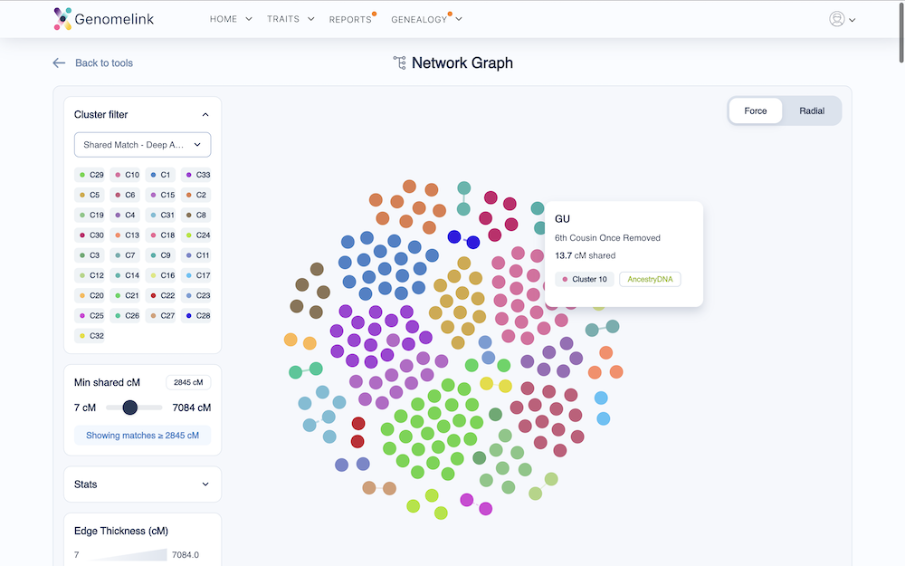
Network Graph is the newest addition to the DNA Match Pro Toolkit. It shows how your matches connect to each other and where each family line sits in your tree. Alongside it, Chromosome Canvas is our DNA visualization tool, joining two other tools we've built for Genealogy Plus and Pro subscribers this year. Together, they provide a complete workflow for making sense of your DNA matches.
Chromosome Canvas
Chromosome Canvas maps each of your shared DNA segments onto a clean chromosome view. You can see at a glance which parts of your DNA come from which family line. Import your Genomelink matches directly,y or paste results from other services, such as MyHeritage or GEDmatch. It's especially useful for figuring out which cluster of matches belongs to which side of your family.
DNA Match Cluster
Our Cluster Reports group your DNA matches into clusters based on the connections they share. Each cluster tends to represent a distinct branch of your family, so structure emerges from what would otherwise be a long, unsorted list of matches. For each cluster, we also generate a written summary with the DNA matches we'd prioritize for review and outreach.
Network Graph & Analysis
Network Graph turns each of those clusters into a visualization you can work with. You can see who shares DNA with whom, which matches sit at the center of a branch, and where your strongest research leads are. The analysis reports also flag Key Individuals (bridge matches), Clustering Coefficient (how tightly connected a cluster is), Endogamy Risk, and Triangulation Groups.
The three tools work together: cluster your matches, see how they connect, then paint them onto your chromosomes to figure out which side each cluster comes from.