Seven picks from independent type designers. Pay once, keep them forever.
|
|
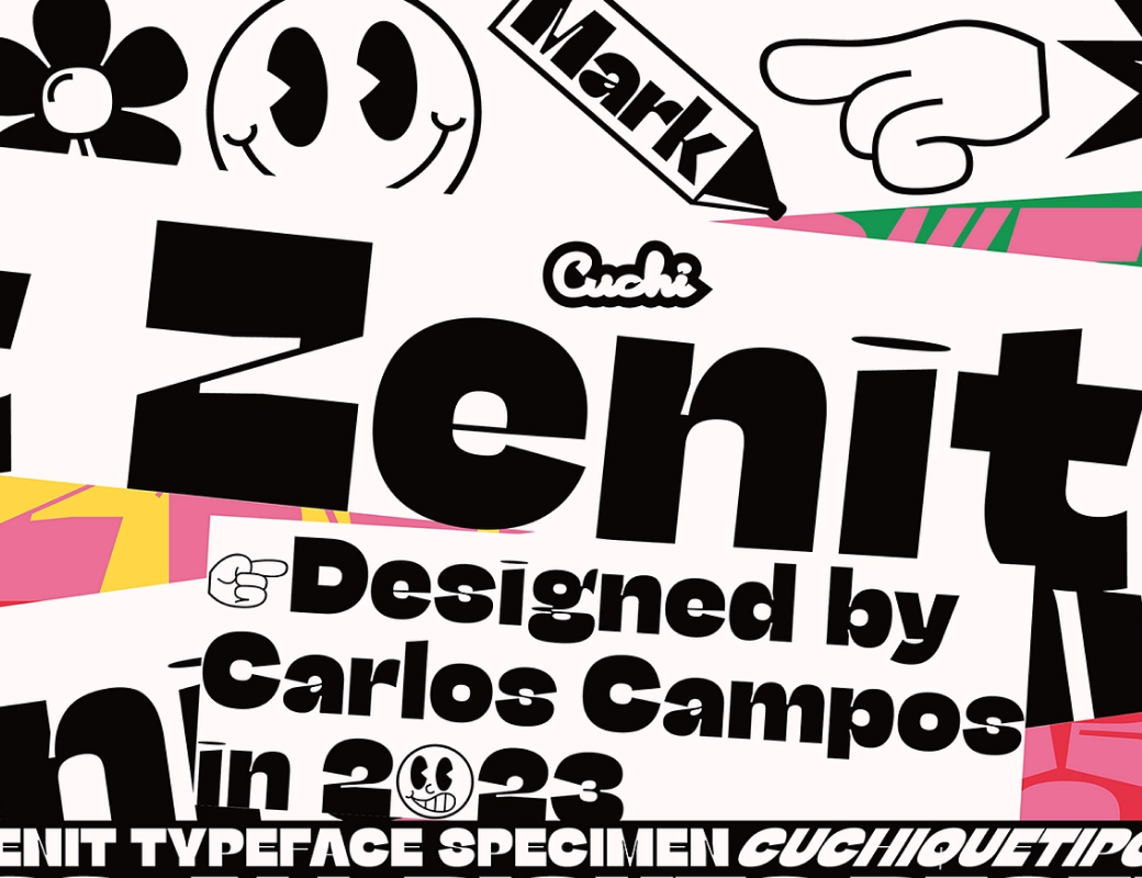 |
| Zenit |
| $9.95 $6.96 |
| A display sans with squeezed proportions and high stroke contrast, pushed hard while keeping a trace of grotesque structure. Nine styles carry a fast, futuristic attitude with a postmodern swagger. |
|
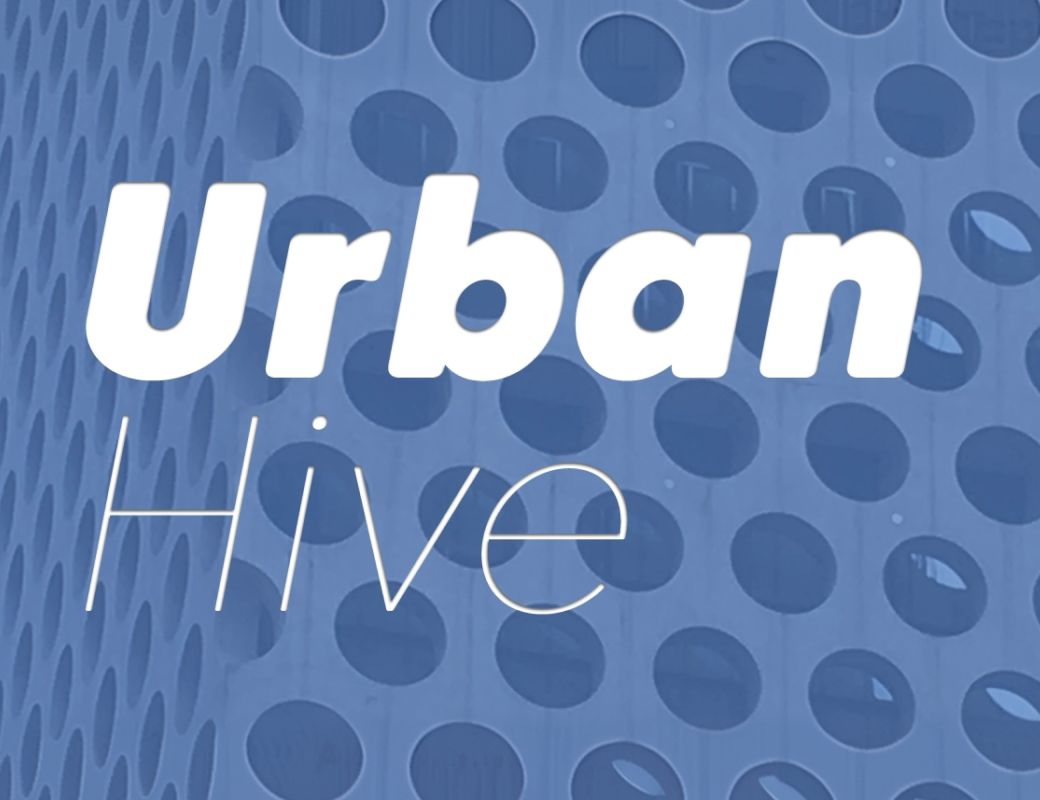 |
| Caros Soft |
| $20.00 $5.00 |
| The rounded cut of a clean geometric sans, with softened corners and carefully tuned spacing between letters. Nine weights from Thin to Black, each with a matching italic, keep text calm and easy to read. |
|
|
|
|
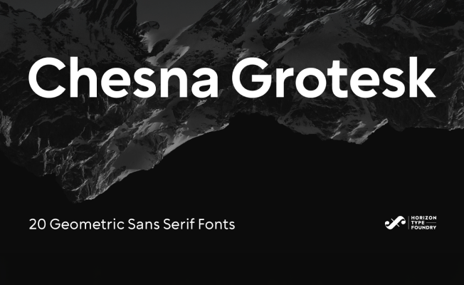 |
| Chesna Grotesk |
| $180.00 $126.00 |
|
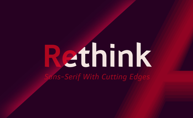 |
| Rethink |
| $29.00 $14.50 |
|
|
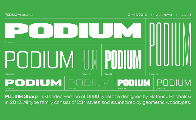 |
| PODIUM Sharp |
| $29.00 $14.79 |
|
|
|
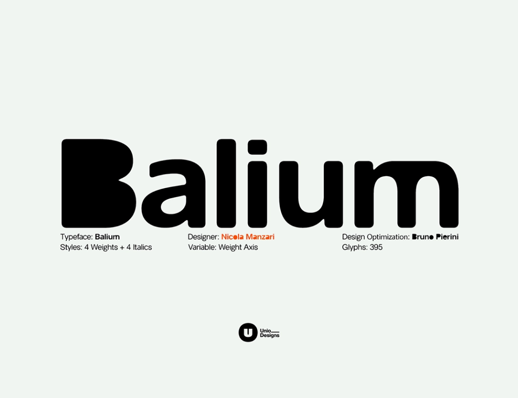 |
| Balium |
| $35.00 $28.00 |
| A sans built from printing errors. Where strokes would normally thin out at the joints, they fill with solid black instead, and the Bad Kerning styles break up the spacing on purpose for a deliberate glitch. |
|
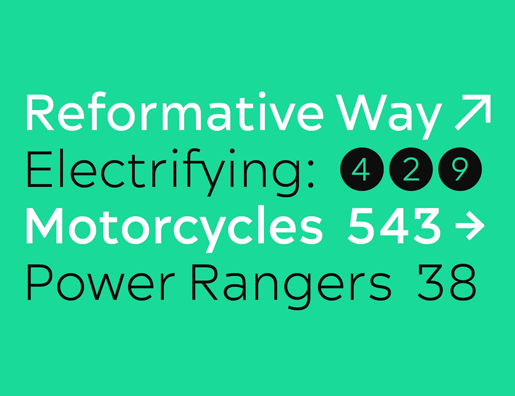 |
| Acherus Feral |
| $180.00 $126.00 |
| A sharpened cut of a rounded geometric sans, with flattened edges, crisp corners, and redrawn letters like A, K, and R that stand steadier. Twenty styles add an alternate G and an optional t for more range. |
|
|
|
|
|
|